pacman::p_load(plotly, ggstatsplot, knitr, patchwork, ggdist, ggthemes,ggrepel, tidyverse,gt,rstatix,ggpmisc,ggridges,gganimate,viridis,ggiraph,reshape2,scales, performance,ggalt,ggpubr,crosstalk, ungeviz, ggdist, colorspace)Take-Home_Ex01
1. Objective
This exercise aims to discover the demographic, financial characteristics and hidden patterns of the City of Engagement, using static and interactive statistical graphics methods. The data will be processed using appropriate tidyverse packages and visualization will be designed using ggplot2 and its extensions.
2. Data Source
For the purpose of this study, two data sets will be used. They are
Participants.csv
Contains information about the residents of City of Engagement that have agreed to participate in this study.
FinancialJournal.csv
Contains information about financial transactions.
3. Data Preparation
3.1 Install and launching R packages
The code chunk below uses p_load() of pacman package to check if packages are installed in the computer. If they are, then they will be launched into R. The R packages installed are:
plotly: R library for plotting interactive statistical graphs.
ggstatsplot: Used for creating graphics with details from statistical tests.gganimate: an ggplot extension for creating animated statistical graphs.gifski: converts video frames to GIF animations using pngquant’s fancy features for efficient cross-frame palettes and temporal dithering. It produces animated GIFs that use thousands of colors per frame.knitr: Used for dynamic report generationpatchwork: Used to combine plotsggdist: Used for visualization distribution and uncertaintyggthemes: Provide additional themes for ggplot2ggrepel: A package in R used for avoiding overplotting of text labelsgt:For creating and styling publication-quality tables in Rrstatix: Used for statistical analysis and data visualizationggridges: For creating ridge plotsviridis: An R package that provides a set of color palettes for data visualizationggiraph: For making ‘ggplot’ graphics interactivereshape2: Provides functions for transforming and reshaping data between “wide” and “long” formatsscales: Provides a set of functions for formatting and labeling data for visualizationtidyverse: A family of modern R packages specially designed to support data science, analysis and communication task including creating static statistical graphs.
3.2 Importing the Data
participants <- read_csv("data/Participants.csv")
financial <- read_csv("data/FinancialJournal.csv")
3.3 Data Wrangling
3.3.1 Check for missing values in each column in the participants and financial data
# Check for missing values in each column in participants data
colSums(is.na(participants))
participantId householdSize haveKids age educationLevel
0 0 0 0 0
interestGroup joviality
0 0 # Check for missing values in each column
colSums(is.na(financial))participantId timestamp category amount
0 0 0 0 3.3.2 Data Issues
Using glimpse(), we can look at the data types of the datasets.
glimpse(participants)Rows: 1,011
Columns: 7
$ participantId <dbl> 0, 1, 2, 3, 4, 5, 6, 7, 8, 9, 10, 11, 12, 13, 14, 15, 1…
$ householdSize <dbl> 3, 3, 3, 3, 3, 3, 3, 3, 3, 3, 3, 3, 3, 3, 3, 3, 3, 3, 3…
$ haveKids <lgl> TRUE, TRUE, TRUE, TRUE, TRUE, TRUE, TRUE, TRUE, TRUE, T…
$ age <dbl> 36, 25, 35, 21, 43, 32, 26, 27, 20, 35, 48, 27, 34, 18,…
$ educationLevel <chr> "HighSchoolOrCollege", "HighSchoolOrCollege", "HighScho…
$ interestGroup <chr> "H", "B", "A", "I", "H", "D", "I", "A", "G", "D", "D", …
$ joviality <dbl> 0.001626703, 0.328086500, 0.393469590, 0.138063446, 0.8…glimpse(financial)Rows: 1,513,636
Columns: 4
$ participantId <dbl> 0, 0, 0, 1, 1, 1, 2, 2, 2, 3, 3, 3, 4, 4, 4, 5, 5, 5, 6,…
$ timestamp <dttm> 2022-03-01, 2022-03-01, 2022-03-01, 2022-03-01, 2022-03…
$ category <chr> "Wage", "Shelter", "Education", "Wage", "Shelter", "Educ…
$ amount <dbl> 2472.50756, -554.98862, -38.00538, 2046.56221, -554.9886…ISSUE 1: WRONG DATA FORMAT
participantId is in <dbl> format. It needs to be converted to <chr>.
participants$participantId <- as.character(participants$participantId)
#str(participants)--> to check if data type has been changed

financial$participantId <- as.character(financial$participantId)
#str(financial) --> to check if data type has been changed
ISSUE 2: CHANGE TIMESTAMP TO MONTH_YEAR FORMAT
Extract the month and year using lubridate.
financial$month_year <- floor_date(as.POSIXct(financial$timestamp), unit = "month")
financial$month_year <- format(financial$month_year, format = "%m/%Y")

# Convert month_year to date format
financial$month_year <- as.Date(paste0("01/", financial$month_year), format = "%d/%m/%Y")

#head(financial) --> check if new col month_year is created
ISSUE 3: DUPLICATES FOUND IN DATA
Check for duplicates in both dataset using the following code chunk,
#Check for duplicates in financial table
sum(duplicated(financial))
[1] 1113#Check for duplicates in participants table
sum(duplicated(participants))[1] 0#Remove duplicates in financial table
financial_unique <- distinct(financial)
nrow(financial_unique)[1] 1512523ISSUE 4: DATA IS SEGREGATED BY INDIVDUAL ENTRIES
Group the entries by participants taking into consideration month_year and category and summing up the amount.
# Group by participant_id and month_year, subgroup by category, then summarize by amount
new_financial <- financial_unique %>%
  group_by(participantId, month_year, category) %>%
  summarise(total_amount = sum(amount)) %>%
  mutate(total_amount = round(total_amount, 2))

# Pivot the table so that the categories appear as columns
new_financial_wide <- new_financial %>%
  pivot_wider(names_from = category, values_from = total_amount)
Next, check if columns have missing value, if yes, replace the missing values with 0
# Check if any columns has missing value
colSums(is.na(new_financial_wide))
participantId month_year Education Food Recreation
0 0 7673 0 1199
Shelter Wage RentAdjustment
131 0 10619 # replace missing values with 0
new_financial_wide <- new_financial_wide %>%
mutate_all(~replace_na(., 0))ISSUE 5: DATA DOES NOT SHOW FINANCIAL HEALTH AND COST OF LIVING
Financial Health = Sum (Wage + Education + Shelter + Recreation + Food + RentAdjustment)
new_financial_wide$Financial_health <- rowSums(new_financial_wide[, c("Wage", "Education","Shelter","Recreation","Food","RentAdjustment" )], na.rm = TRUE)Cost_of_living = Sum(Education + Shelter + Recreation + Food)
new_financial_wide$Cost_of_living <- rowSums(new_financial_wide[,c("Education","Shelter","Recreation","Food")], na.rm = TRUE)
new_financial_wide$Cost_of_living <- new_financial_wide$Cost_of_living * -1
ISSUE 6: AGE DATA ARE NOT AGGREGATED
Bin age data by groups of 10.
participants <- participants %>%
  mutate(age_bin = cut(age,
                       breaks = c(seq(max(age), min(age) - 10, -10), min(age)),
                       right = FALSE,
                       include.lowest = TRUE,
                       labels = NULL))

# Replace the numeric bin labels with age ranges
participants$age_bin <- sub("(\\d+)-(\\d+)", "\\1-\\2", as.character(participants$age_bin))
participants$age_bin[participants$age_bin == paste0(max(participants$age_bin), "-")] <- paste0("<= ", max(as.numeric(levels(participants$age_bin)))-1)

# Display the first 10 rows of the new data frame with age_bin column
#head(participants, 10)
ISSUE 7: PARTICIPANTS DATA AND FINANCIAL DATA ARE SEPARATED
Combine the two tables together by participantId
combined_table <- merge(participants, new_financial_wide, by = "participantId")
DT::datatable(combined_table, class= "compact")
4. Data Analysis
4.1 Demographic Analysis
4.1.1 Distribution of Income and Age
Distribution of Income
We will first take a look at the Income Distribution using histogram and boxplot.
Based on the boxplot plotted, we can observe that the minimum income is $1600, which means that all the participants are considering under the working population and we can analyse them as a whole.
Furthermore, we can observe from the shape of the wage distribution that there is income inequality in the city. It has a right-skewed distribution, i.e. mean wage > median wage, where there is very few high earners at the top and majority falls under the middle and bottom.
Show the code
#computing summary statistics of mean, median and lower and upper whiskers in boxplot
wage_mean <- round(mean(combined_table$Wage))
wage_median <- round(median(combined_table$Wage))
ymax <- as.numeric(round((IQR(combined_table$Wage)*1.5) +
                quantile(combined_table$Wage,0.75)))
ymin <- as.integer(min(combined_table$Wage))

#plotting histogram
h_wage <- ggplot(data = combined_table, aes(x = Wage)) +
  geom_histogram(color="black", fill="azure4", binwidth = 500) +
  scale_x_continuous(limits = c(0,25000), labels = scales::comma) +
  labs(x = "Wage", y = "Number of participants") +
  geom_vline(aes(xintercept = wage_mean), col="darkblue", linewidth=0.75) +
  annotate("text", x=5900, y=1700, label="Mean wage:",
           size=3, color="darkblue") +
  annotate("text", x=5600, y=1550, label=format(wage_mean, big.mark = ","),
           size=3, color="darkblue") +
  geom_vline(aes(xintercept = wage_median), col="lightpink4", linewidth=0.75) +
  annotate("text", x=1900, y=1700, label="Median wage",
           size=3, color="lightpink4") +
  annotate("text", x=1900, y=1600, label=format(wage_median, big.mark = ","),
           size=3, color="lightpink4") +
  theme(axis.text.x = element_text(size=8))

#plotting boxplot
b_wage <- ggplot(data = combined_table, aes(y = Wage)) +
  geom_boxplot(outlier.colour="firebrick", outlier.shape=16,
               outlier.size=0.6, notch=FALSE, width = 0.25) +
  coord_flip() + labs(y = "", x = "") +
  scale_y_continuous(limits = c(0,25000), labels = scales::comma) +
  theme(axis.text = element_blank(), axis.ticks = element_blank()) +
  stat_boxplot(geom="errorbar", width=0.25) +
  annotate("text", x=0.20, y=ymax, label=format(ymax, big.mark = ","),
           size=3, color="lightpink4") +
  annotate("text", x=0.20, y=ymin, label=format(ymin, big.mark = ","),
           size=3, color="lightpink4") +
  annotate("text", x=-0.25, y=5000, label=format(wage_median, big.mark = ","),
           size=3, color="lightpink4") +
  annotate("text", x=-0.25, y=2500, label="Median wage =",
           size=3, color="lightpink4")

# combine the 2 plots

wage_distri <- b_wage / h_wage + plot_layout(heights = c(1, 2))

wage_distri + plot_annotation(title = "Distribution of Wage",
                               subtitle = str_wrap("There is a right-skewed distribution i.e. mean wage > median wage. There is also a large number of outliers (wage >$9,110).", width =60),
                               theme = theme(
                                 plot.title = element_text(size = 18),
                                 plot.subtitle = element_text(size = 12)))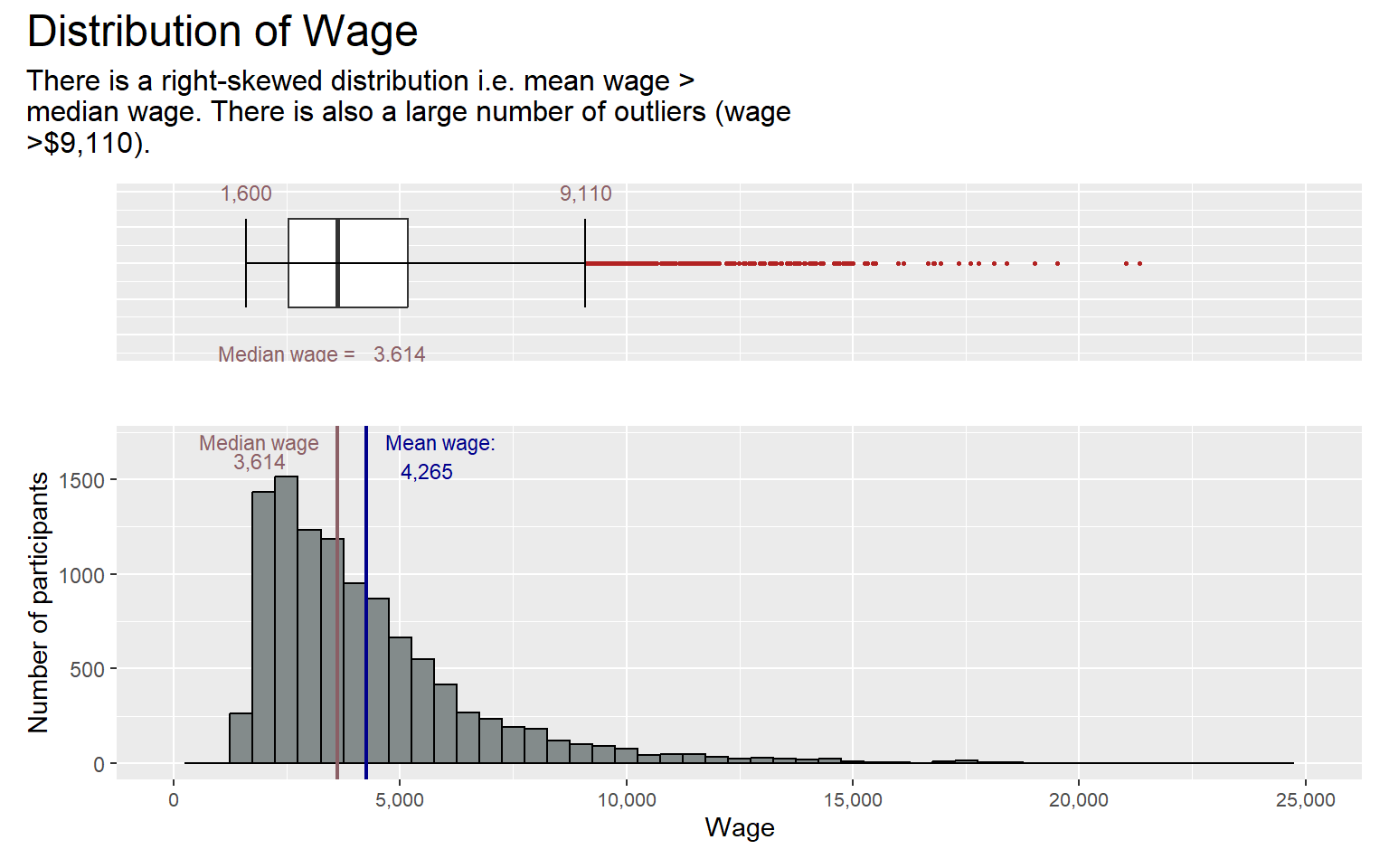
To confirm that the wage distribution is indeed not normally distributed, we will perform the normality assumption test. But before performing the normality assumption test, we will first create the meanwage_table as shown in the code chunk below,
# Create mean wage table
meanwage_table <- combined_table %>%
  group_by(participantId) %>%
  summarize(mean_wage = mean(Wage))
#head(meanwage_table)
Next, we will use the Q-Q Plot to visualize if normal distribution exist.
Show the code
#| echo: false
#| fig-width: 3
#| fig-height: 3

qq <- ggplot(meanwage_table,
       aes(sample=mean_wage))+
  stat_qq() +
  stat_qq_line() +
  ggtitle("Normal Q-Q Plot of Income")

sw_t <- meanwage_table %>%
  shapiro_test(mean_wage) %>%
  gt() #make it to gt format to give a nice table

tmp <- tempfile(fileext = '.png')
gtsave(sw_t, tmp)
table_png <- png::readPNG(tmp,native=TRUE) #sw_t cant be recognised by patchwork so change it to png

qq + table_png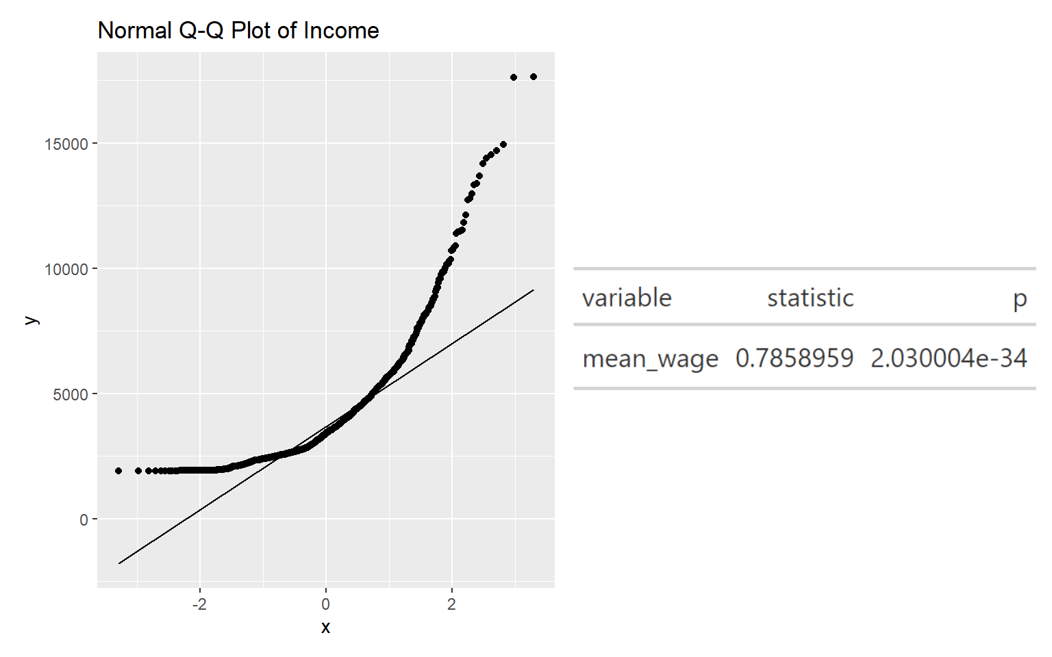
Looking at Normal Quartile Plot (Q-Q plot), we can see that the points deviate significantly from the straight diagonal line. The results of the Shaprio-test above also suggest that there is sufficient statistical evidence to reject the null hypothesis at 95% confidence. Thus, the set of data is indeed not normally distributed, showing that the city has income inequality.
Distribution of Age
Similarly, we will use histogram and boxplot to show the age distribution.
The boxplot below shows that the minimum age is 18 and the maximum age is 60, which is most likely the retirement age. The histogram shows that the age is normally distributed,where the mean age equals the median age of 39. Thus, it appears that the city of engagement does not need to worry about aging population, which in turn meant that they do not need to invest in improving birth rate.
However, based on the pie chart, we can see that though the starting age is 18, only 5% of the working population is below the age of 21. This is probably because most are still studying at that age and are not actively working.
Show the code
age_count <- combined_table %>%
  group_by(age_bin) %>%
  summarize(
    count = n_distinct(participantId)) %>%
  mutate(prop_count = as.numeric(count) / n_distinct(as.numeric(combined_table$participantId)),
         age_pie_pct = round(prop_count * 100)) %>%
  mutate(ypos_p = rev(cumsum(rev(age_pie_pct))),
         pos_p = age_pie_pct/2 + lead(ypos_p, 1, default = 0),
         pos_p = if_else(is.na(pos_p), age_pie_pct/2, pos_p))

pie_age <- ggplot(age_count, aes(x = "" , y = age_pie_pct, fill = fct_inorder(age_bin))) +
  geom_col(width = 1, color = 1) +
  coord_polar(theta = "y") +
  scale_fill_brewer(palette = "YlGnBu") +
  geom_label_repel(data = age_count,
                   aes(y = pos_p, label = paste0(age_pie_pct, "%")),
                   size = 4.5, nudge_x = 1, color = c(1, 1, 1, 1, 1), show.legend = FALSE) +
  guides(fill = guide_legend(title = "Age Bin")) +
  labs(title = "Proportion of participants in each Age Bin") +
  theme(legend.position = "bottom",
        plot.title = element_text(face = "bold")) +
  theme_minimal()
Show the code
#computing summary statistics of mean, median and lower and upper whiskers in boxplot for AGE
age_mean <- round(mean(combined_table$age))
age_median <- round(median(combined_table$age))
ymax <- max(combined_table$age)
ymin <- as.integer(min(combined_table$age))

#plotting histogram for AGE
h_age <- ggplot(data = combined_table, aes(x = age)) +
  geom_histogram(color="black", fill="azure4", binwidth = 4) +
  scale_x_continuous(limits = c(0,70), labels = scales::comma) +
  labs(x = "Age", y = "Number of participants") +
  geom_vline(aes(xintercept = age_mean), col="black", linewidth=0.75) +
  annotate("text", x=48, y=1700, label="Mean age:",
           size=3, color="black") +
  annotate("text", x=48, y=1600, label=format(age_mean, big.mark = ","),
           size=3, color="black") +
  geom_vline(aes(xintercept = age_median), col="black", linewidth=0.75) +
  annotate("text", x=30, y=1750, label="Median age:",
           size=3, color="black") +
  annotate("text", x=30, y=1650, label=format(age_median, big.mark = ","),
           size=3, color="black") +
  theme(axis.text.x = element_text(size=8))

#plotting boxplot for AGE
b_age <- ggplot(data = combined_table, aes(y = age)) +
  geom_boxplot(outlier.colour="firebrick", outlier.shape=16,
               outlier.size=1, notch=FALSE, width =0.2) +
  coord_flip() + labs(y = "", x = "") +
  scale_y_continuous(limits = c(0,70), labels = scales::comma) +
  theme(axis.text = element_blank(), axis.ticks = element_blank()) +
  stat_boxplot(geom="errorbar", width=0.2) +
  annotate("text", x=0.15, y=ymax, label=format(ymax, big.mark = ","),
           size=3, color="lightpink4") +
  annotate("text", x=0.15, y=ymin, label=format(ymin, big.mark = ","),
           size=3, color="lightpink4")
  #annotate("text", x=-0.25, y=50, label=format(age_median, big.mark = ","),
           #size=3, color="lightpink4")
  #annotate("text", x=-0.25, y=25, label="Median age =",
           #size=3, color="lightpink4")

age_distri <- b_age / h_age + plot_layout(heights = c(1, 2))

# age_distri + plot_annotation(title = "Distribution of Age",
#                                subtitle = "There is a normal distribution i.e. mean age = median age",
#                                theme = theme(
#                                  plot.title = element_text(size = 18),
#                                  plot.subtitle = element_text(size = 12)))
Show the code
#combine the age_distri plot dervied earlier with the pie_age plot
age_distri_pie <- (age_distri | pie_age) + plot_layout(widths = c(3,3))

age_distri_pie + plot_annotation(title = "Distribution of Age",
                               theme = theme(
                                 plot.title = element_text(size = 16)))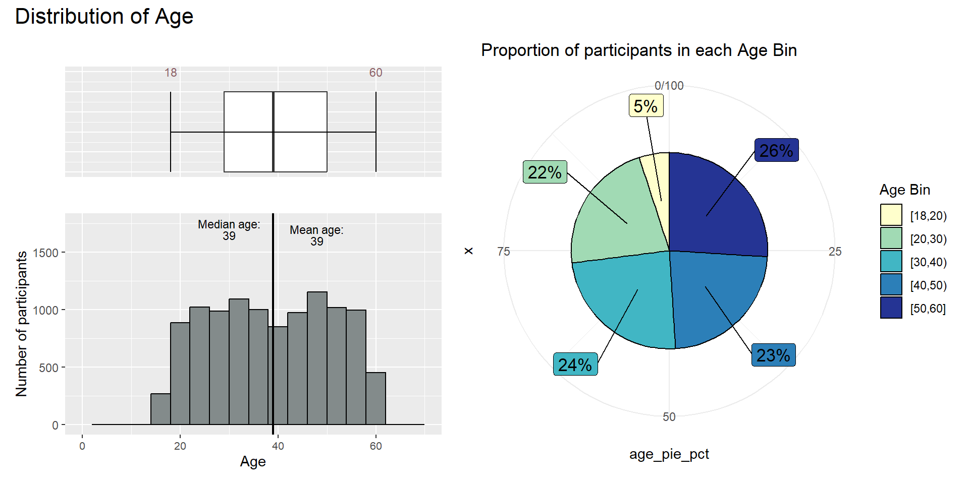
4.1.2 Income by Age
Let’s find out if income is affected by age.
To compare the income level across ages, we will test the following null hypothesis:
H0: the mean wage across different age groups are the same
H1: the mean wage across different age groups are different
To start the confirmatory data analysis, we first perform the normality assumption test for the distribution of income and age. Normality assumption test for income has been performed previously.
Plot the qqplot for income and age.
Show the code
#| echo: false
#| fig-width: 3
#| fig-height: 3

# Create age table
unique_participants <- unique(subset(combined_table, select = c("participantId", "age")))
head(unique_participants)
participantId age
1 0 36
13 1 25
25 10 48
37 100 29
49 1000 56
61 1001 49Show the code
qq_age <- ggplot(unique_participants,
       aes(sample=age))+
  stat_qq() +
  stat_qq_line() +
  ggtitle("Normal Q-Q Plot of Age")

sw_t_age <- unique_participants %>%
  shapiro_test(age) %>%
  gt() #make it to gt format to give a nice table

tmp_age <- tempfile(fileext = '.png')
gtsave(sw_t_age, tmp_age)
table_png_age <- png::readPNG(tmp_age,native=TRUE) #sw_t cant be recognised by patchwork so change it to png

(qq_age + table_png_age) / (qq + table_png)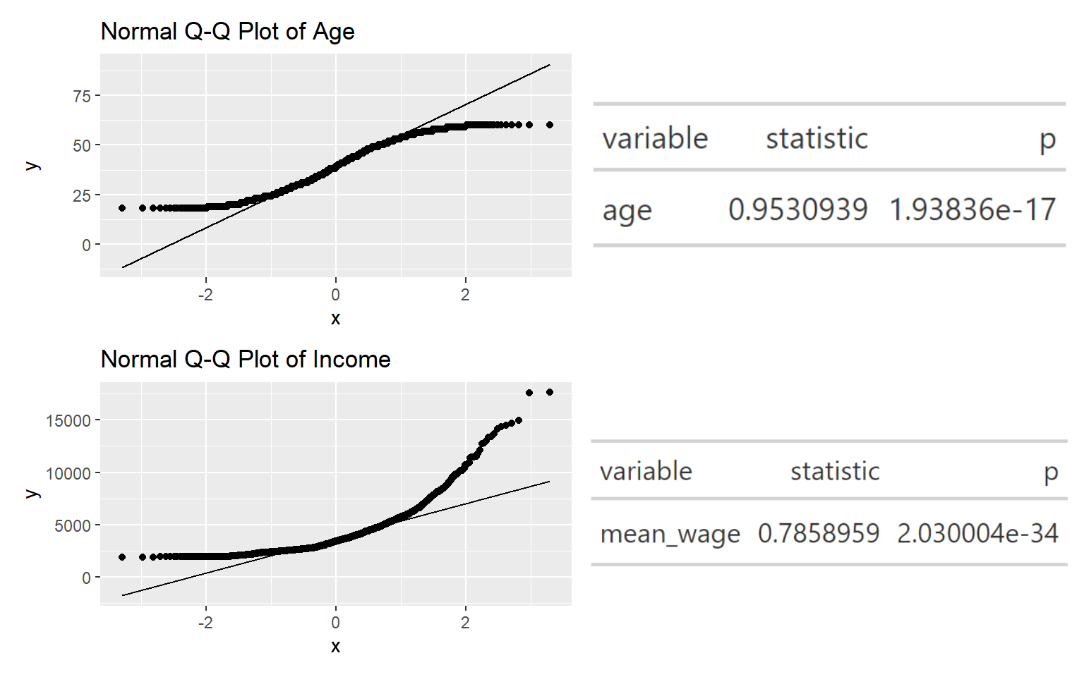
Based on the Shapiro test, both the p-value are < alpha value of 0.05, thus there is sufficient statistical evidence to conclude that the distribution of income and age are not normally distributed. Thus we will perform the non-parametric test, Oneway ANOVA Test.
Show the code
ggbetweenstats(
  data = combined_table,
  x = age_bin,
  y = Wage,
  type = "np",
  mean.ci = TRUE,
  pairwise.comparisons = TRUE,
  pairwise.display = "ns",
  p.adjust.method = "fdr",
  messages = FALSE,
  ylim = c(0, 25000)
) +
ggtitle("Oneway ANNOVA - Income across different age")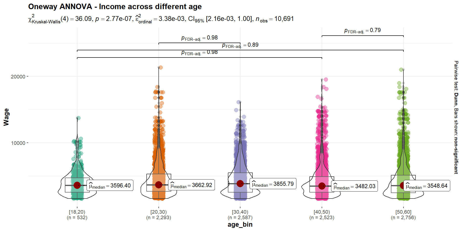
The Kruskal-Wallis Test p-value is lower than the alpha values, thus there is sufficient statistical evidence to reject the null hypothesis and infer that the mean income across age is not the same.
We can observe that there are few pairs of age_bin with p-value > 0.05 such as [40,50) and [50,60]. This suggests that the differences between the medians of the pair are not statistically significant.
We can also observe that there is a higher wage median for those age 30-40. After the age of 40, it seems that the increase in age is not consistent with the increase in wage. The 2 highest wage level are from the opposite ends of the age spectrum. Though these are outliers, it suggests that age is not the limiting factor for high wage tier. It does not necessary mean that an individual has to be older to earn a higher income.
4.1.3 Financial Health Observation
Cumulative Financial Health
Create a table to plot the cumulative financial health to see if there are cumulative savings in the city.
# Create a data frame
df_totalfh <- combined_table %>%
  group_by(month_year) %>%
  summarise(total_fh = sum(Financial_health))

#head(df_totalfh)
Show the code
# calculate cumulative financial health
df_totalfh <- df_totalfh %>%
  mutate(cumulative_fh = cumsum(total_fh))

head(df_totalfh)
# A tibble: 6 × 3
month_year total_fh cumulative_fh
<date> <dbl> <dbl>
1 2022-03-01 4832812. 4832812.
2 2022-04-01 2204851. 7037663.
3 2022-05-01 2403220. 9440883.
4 2022-06-01 2421291. 11862173.
5 2022-07-01 2272492. 14134666.
6 2022-08-01 2574129. 16708794.Show the code
# Calculate y-axis breaks and labels
y_breaks <- pretty_breaks(n = 3)(range(df_totalfh$cumulative_fh))
y_labels <- dollar_format(prefix = "$")(y_breaks)

# plot graph
ggplot(data = df_totalfh, aes(x = month_year, y = cumulative_fh)) +
  geom_line() +
  labs(x = "Month/Year", y = "Cumulative Financial Health", title = "Cumulative Financial Health Over Time") +
  stat_summary(geom = "line", fun = "cumsum", linetype = "dashed") +
  scale_y_continuous(breaks = y_breaks, labels = y_labels) +
  scale_x_date(date_breaks = "1 month", date_labels = "%m/%Y") +
  theme(plot.title = element_text(face = "bold"),
        plot.margin = unit(c(0.5, 0.5, 0.5, 0.5), "cm"))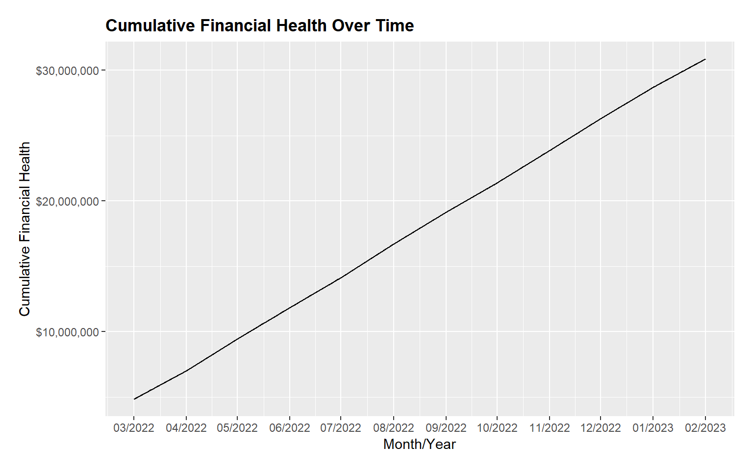
From the figure above, we can see that the city has cumulative savings across the months.
Diving deeper into the financial health of the participants, we will plot the boxplot of the Financial Health vs Mean Financial Health. Based on the plot below, we can see that the mean of the financial health is at the highest in March 2022 at around $4800 and decreased significantly in April 2022. Between April 2022 to Feb 2023, financial health was maintained between $2,500 to $3,000.
Show the code
p_fh <- ggplot(data = combined_table, aes(x = month_year, y = Financial_health,
tooltip = month_year)) +
geom_boxplot() +
geom_point(stat = "summary", fun.y = "mean", colour = "red", size = 1) +
geom_line(stat = "summary", fun.y = "mean", colour = "red", size = 0.5) +
theme_minimal() +
scale_fill_brewer(palette = "Dark2") +
labs(title = "Financial Health Over Time",
y = "Financial Health",
x = "Month/Year") +
theme(plot.title = element_text(hjust = 0.2, size = 12, face = 'bold'),
plot.margin = margin(20, 20, 20, 20),
legend.position = "bottom",
axis.text = element_text(size = 8, face = "bold"),
axis.text.x = element_text(angle = 45, vjust = 0.5, hjust = 1),
axis.title.x = element_text(hjust = 0.5, size = 12, face = "bold"),
axis.title.y = element_text(hjust = 0.5, size = 12, face = "bold")) +
scale_x_date(date_breaks = "1 month", date_labels = "%b-%Y")
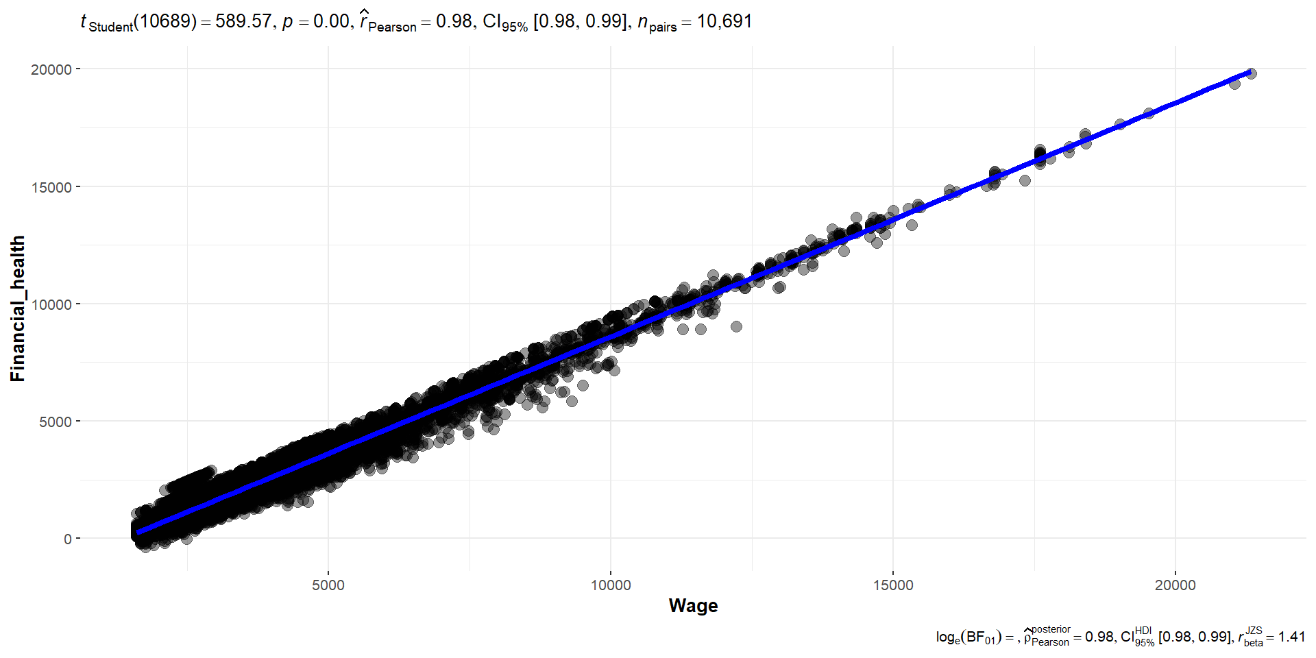
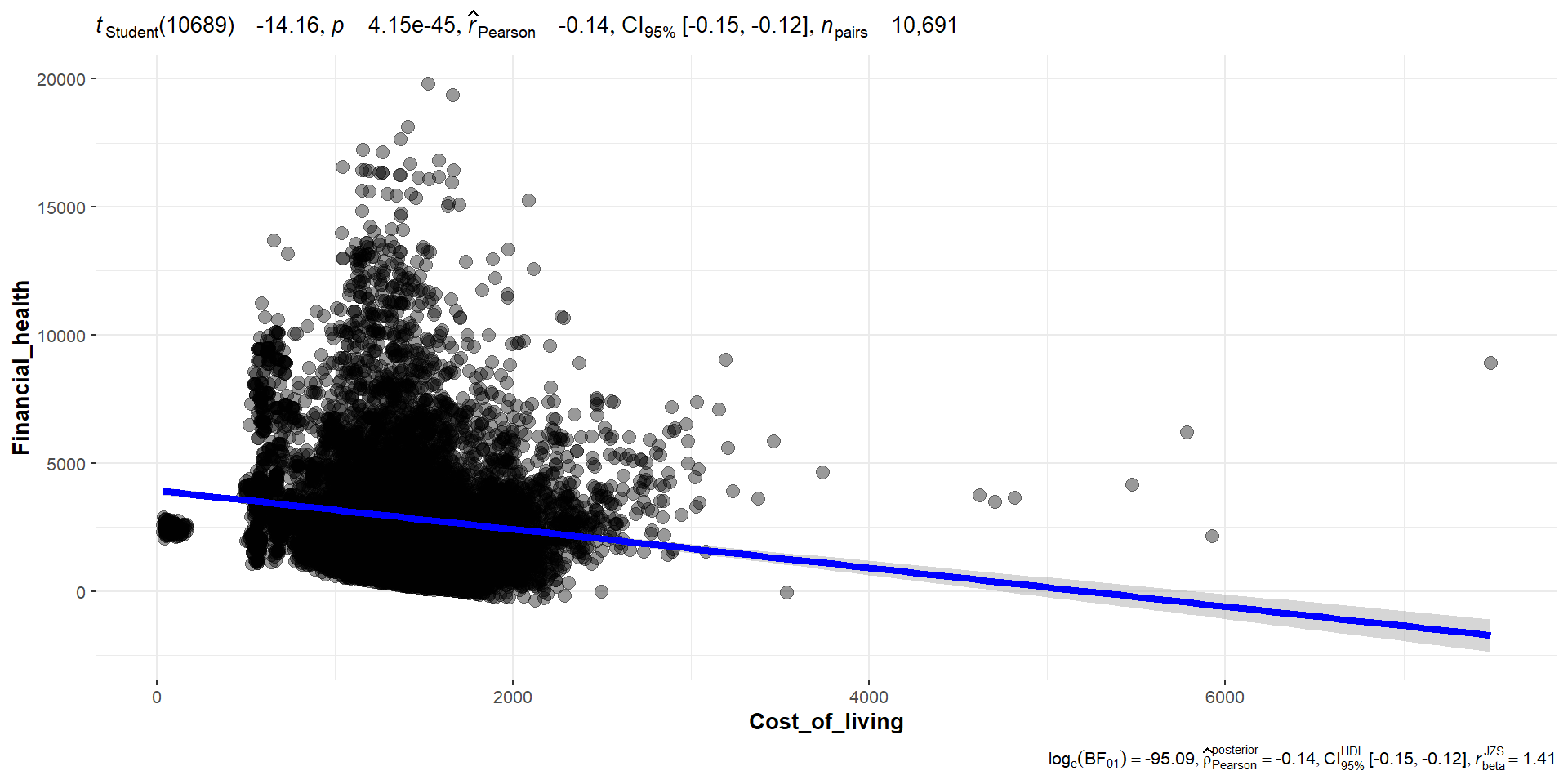
ggplotly(p_fh, tooltip = c("x", "y", "tooltip"))To find out if financial health is affected by wage or cost of living, we use the correlogram to see the correlation between financial health and wage, cost of living and the various expense category. Based on the correlation table and the significant test of correlation, we can see that financial health and wage has a strong positive correlation of 0.98 , while cost of living has low negative correlation of -0.14.
Based on the correlogram below, we can also observe that Recreation and Shelter have a high correlation with Cost of living.
Show the code
# Select columns by name for the correlation matrix
cols <- c( "Wage", "Financial_health", "Cost_of_living", "Food", "Shelter", "Recreation", "Education", "RentAdjustment")

# Plot the ggcorrmat
ggstatsplot::ggcorrmat(
  data = combined_table,
  cor.vars = cols, hc.order = TRUE, p.mat=p.mat,
  title = "Financial Health Correlation Table")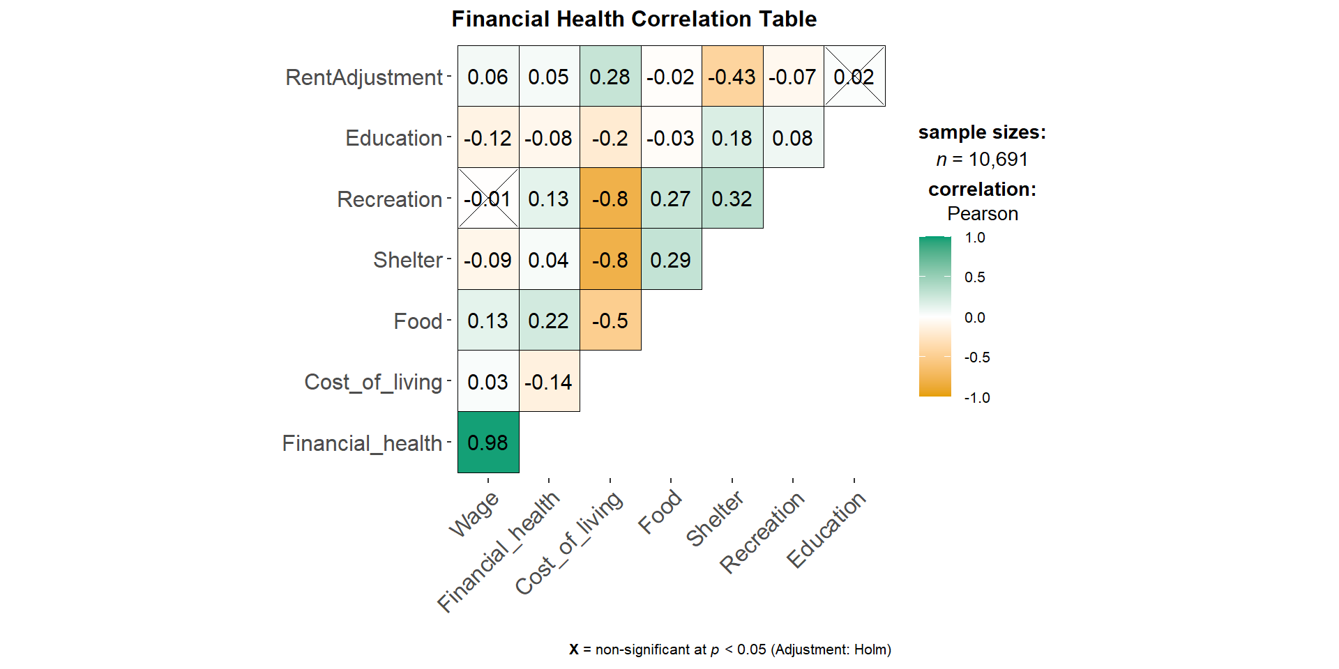
Show the code
ggscatterstats(
  data = combined_table,
  x = Wage,
  y = Financial_health,
  marginal = FALSE,
  )
Show the code
ggscatterstats(
  data = combined_table,
  x = Cost_of_living,
  y = Financial_health,
  marginal = FALSE,
  )
To further explore each expense category over time, we will plot the different expense category over time.
Show the code
# group the expenses by month year
expenses_grouped <- combined_table %>%
  group_by(month_year) %>%
  summarize(total_recreation = mean(Recreation),
            total_food = mean(Food),
            total_shelter = mean(Shelter),
            total_education = mean(Education))

# plot the data using ggplot2
p_expense <- ggplot(expenses_grouped, aes(x = month_year)) +
  geom_line(aes(y = total_recreation, color = "Recreation")) +
  geom_line(aes(y = total_food, color = "Food")) +
  geom_line(aes(y = total_shelter, color = "Shelter")) +
  geom_line(aes(y = total_education, color = "Education")) +
  labs(x = "Month/Year", y = "Mean Expenses($)") +
  scale_y_continuous(limits = c(-1000, 0),
                      breaks = seq(-1000, 0, 2*100),
                      labels = dollar_format(prefix = "$")) +
  scale_x_date(date_breaks = "1 month", date_labels = "%m/%Y") +
  ggtitle("Expenses Over time") +
  scale_color_manual(values = c("Recreation" = "red",
                                "Food" = "blue",
                                "Shelter" = "green",
                                "Education" = "purple")) +
  theme(plot.title = element_text(face = "bold"),
        axis.text.x = element_text(angle = 45, vjust = 0.5, hjust = 0.5))
Also, we shall plot the wage over time to compare it with the expenses over time plot.
Show the code
# group the wage by month year
wage_grouped <- combined_table %>%
  group_by(month_year) %>%
  summarize(mean_wage_bymonth = mean(Wage))

# plot the data using ggplot2
p_meanwage <- ggplot(wage_grouped, aes(x = month_year)) +
  geom_line(aes(y = mean_wage_bymonth)) +
  labs(x = "Month/Year", y = "Mean Wage($)") +
  scale_x_date(date_breaks = "1 month", date_labels = "%m/%Y") +
  ggtitle("Expenses by Month/Year") +
  theme(plot.title = element_text(face = "bold"),
        axis.text.x = element_text(angle = 45, vjust = 0.5, hjust = 0.5))
For easier comparison, we shall combine the 2 plots together for better visualization.
expenses_wage <- p_expense + p_meanwage + plot_layout(heights = c(80, 50))
expenses_wage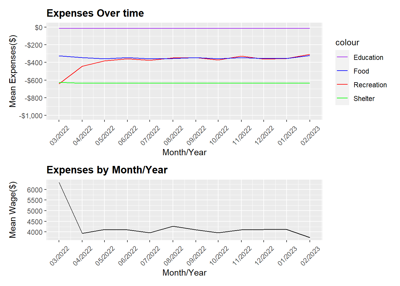
Looking at the expenses over time plot above, it showed that education, food and shelter remained stable over time, which meant these costs are most likely fixed despite any wage fluctuations. Recreation expenses, on the hand, is high in March and decreases significantly from March 2022 to April 2022 and plateaus to a stable rate thereafter.
Looking at the wage over time plot, we can see that in March, the mean income is at its peak in March 2022 and dips significantly in April 2022. April 2022 onward, the income remains relatively stable and starts to increase slightly in August 2022, but in Jan 2023 it start to decrease further. The fluctuations in the financial health and income is directly proportionate. And we can also see that, recreation expenses increases when there is an increase in income but remain low when income is low.
Since this is an agricultural city, participants’ pay could be likely to be affected by the seasons and harvest.
Wage vs Cost of Living overtime
Looking at the wage vs cost of living, we can see that on average, most citizens can cope with their cost of living as their mean wage (blue bars) is higher than the mean cost of living (red bars). Most citizens should still have savings monthly.
# Creating a table with Wage and Cost of Living by month_year

# Group the data by month and find the corresponding means
df_monthly <- combined_table %>%
  group_by(month_year) %>%
  summarise(mean_income = mean(Wage),
            mean_cost_of_living = mean(Cost_of_living))
# Melt the data frame to create a long format
df_monthly_melt <- melt(df_monthly, id.vars = "month_year", variable.name = "variable", value.name = "value")
Show the code
# Plot using ggplot2
ggplot(df_monthly_melt, aes(x = month_year, y = value, fill = variable)) +
  geom_bar(stat = "identity", position = position_dodge(width = 25), alpha = 0.7) +
  scale_fill_manual(name = "Legend", values = c("mean_income" = "blue", "mean_cost_of_living" = "red")) +
  labs(x = "Month", y = "Mean", title = "Monthly Mean Income and Cost of Living") +
  scale_x_date(guide = guide_axis(angle = 45)) +
theme(axis.text.x = element_text(hjust = 0.4, vjust = 0.5, size = 5)) 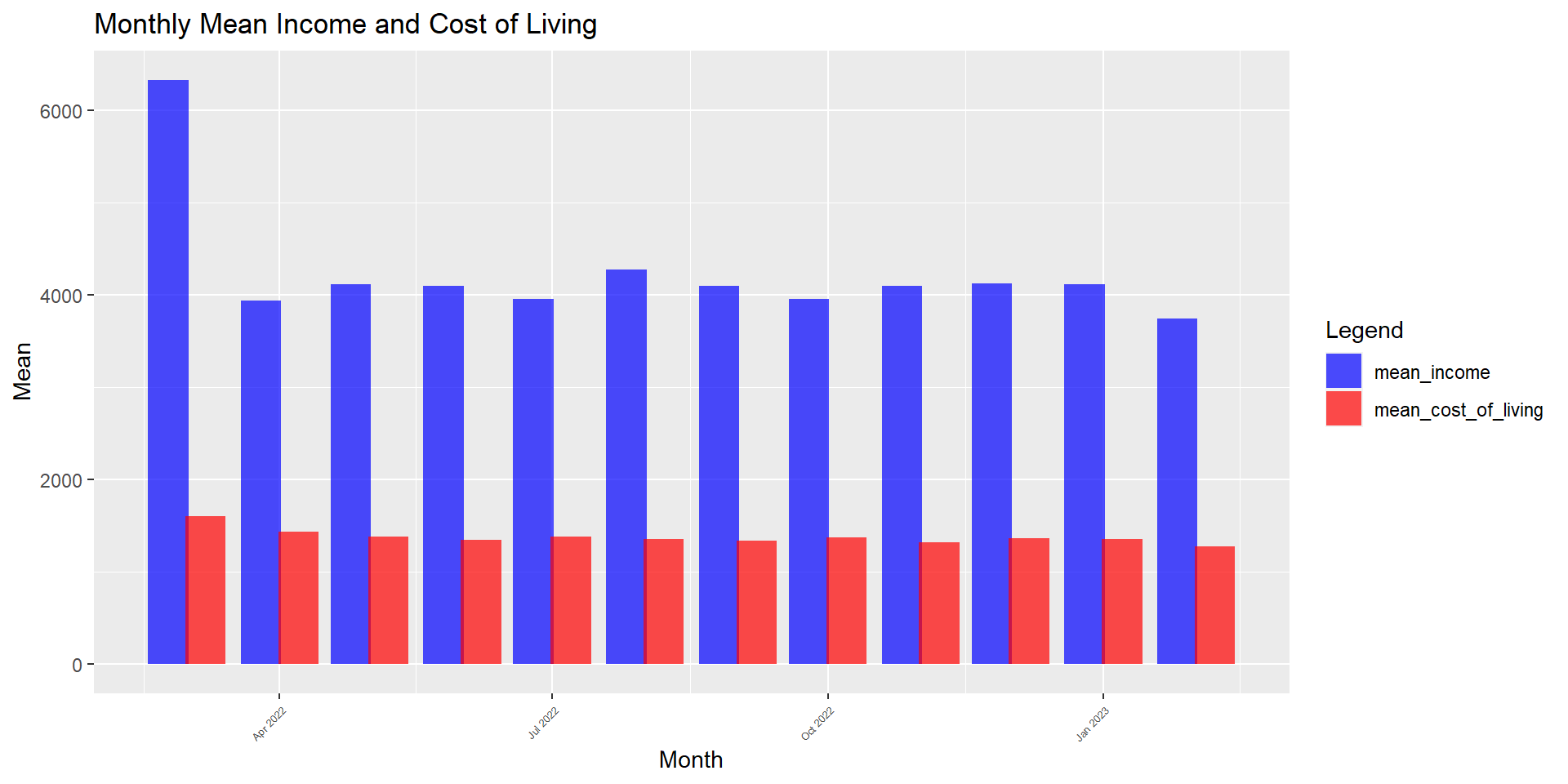
4.1.4 Observation on Education Level
Education affects financial health and birth rate
To see if education affects financial health and birth rate, we will create the boxplot as shown below.
Show the code
# Create a factor with the education levels in the desired order
edu_levels <- c("Low", "HighSchoolOrCollege", "Bachelors", "Graduate")
combined_table$educationLevel <- factor(combined_table$educationLevel, levels = edu_levels)

# Create a box plot with separate panels for individuals with and without kids
p_fh_kids <- ggplot(combined_table, aes(x = educationLevel, y = Financial_health, fill = haveKids)) +
  geom_boxplot() +
  stat_summary(aes(group = haveKids, color = haveKids), fun = mean, geom = "line", size = 0.5) + # add mean lines
  stat_boxplot(geom='errorbar', width=0.1, coef=1.5, size=0.5) + # add error bars
  scale_fill_manual(name = "haveKids", values = c("FALSE" = "grey", "TRUE" = "orange")) +
  labs(title = "Boxplot of Financial Health and Education by Kids", x = "Education", y = "Financial Health") +
  facet_wrap(~haveKids, ncol = 2) +
  theme_bw() +
  theme(plot.title = element_text(face = "bold"),
    axis.text.x = element_text(angle = 45, hjust = 1))

# Display the plot
ggplotly(p_fh_kids)
We observe here that education is positively correlated to wage and financial health of the citizens. The higher the education level, the higher the financial health. Also, we can see that citizen with kids tend to have better financial health overall. Thus, showing that good education is necessary for higher wage.
To further confirm that wage is affected by education level, we will test the following null hypothesis:
H0: the mean wage across different education levels are the same
H1: the mean wage across different education levels are different
As based on previous normality assumption test done for wage, we know that wage is not normally distributed. Thus, to test the null hypothesis, we will perform the non-parametric test, Oneway ANOVA Test.
Show the code
ggbetweenstats(
  data = combined_table,
  x = educationLevel,
  y = Wage,
  type = "np",
  mean.ci = TRUE,
  pairwise.comparisons = TRUE,
  pairwise.display = "ns",
  p.adjust.method = "fdr",
  messages = FALSE,
  ylim = c(0, 25000),
  breaks = seq(0, 25000, 5000)
) +
ggtitle("Oneway ANNOVA - Income across different educationLevel")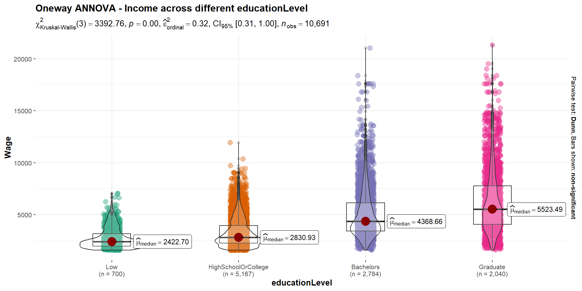
Since the p-value < critical value of 0.05, there is statistical evidence to reject the null hypothesis. We can thus conclude that education indeed does affect one’s wage and overall the median wage is higher for higher education level, which is consistent with our findings earlier.
4.2 Observation on Joviality
To find out the factors that could possibly affect joviality, we plot the below correlogram. However, looking at the plot below, we can see that none of the factors have correlation more than 0.5. Joviality has a negative correlation relationship with wage, expense, and savings.
Show the code
# Select columns by name for the correlation matrix
cols <- c("joviality", "Wage", "Financial_health", "Cost_of_living", "age", "householdSize")

# Plot the ggcorrmat
ggstatsplot::ggcorrmat(
  data = combined_table,
  cor.vars = cols, hc.order = TRUE, p.mat=p.mat,
  title = "Joviality Correlation Table")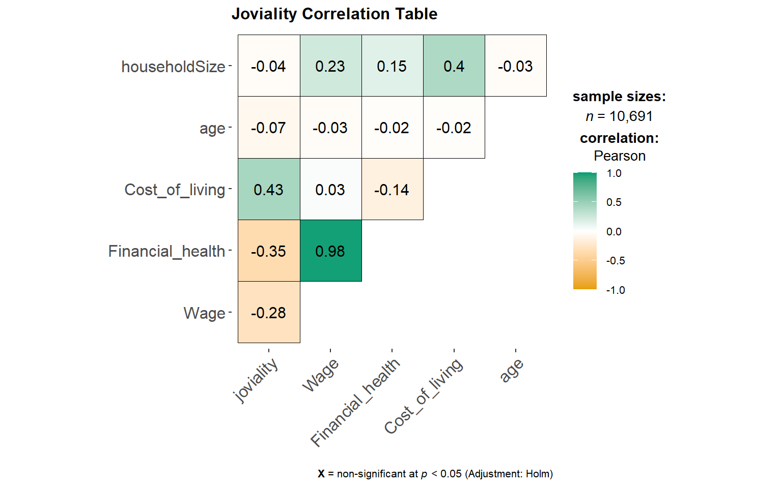
4.2.1 Joviality is affected by Financial health
Even though correlation between joviality is weak (-0.35), we can observe the smooth red curve is relatively different across different income levels. It appears joviality has a strong correlation for lower income levels as compaeed to the rich. when broken down in health levels, it appears that joviality has the lowest correlation for middle income, the R2= 0.006.
However, we also observed that there are poor people who have the highest joviality of 0.90 whereas for the income earners (in red), all of them have a joviality score below 0.64. Thus, we can conclude that being rich does not necessarily make citizens happy.
Show the code
# Create the plot
p_j <- ggplot(combined_table, aes(x = Financial_health, y = joviality, color = Wage)) +
  geom_point() + # Scatter plot
  geom_smooth(method = "loess", se = FALSE, colour = "red") + # Add smoother
  scale_y_continuous(limits = c(0, 1)) + # Set Y-axis limits to 0-1
  scale_color_gradient(low = "blue", high = "red") # Set color scale from blue to red

ggplotly(p_j)
Show the code
library(ggpmisc)
# Compute the 25th and 75th percentiles of Financial_health
q <- quantile(combined_table$Financial_health, probs = c(0.25, 0.75))

# Create a new column "income_level" based on Financial_health percentiles
combined_table$income_level <- ifelse(combined_table$Financial_health < q[1], "Low",
                                      ifelse(combined_table$Financial_health > q[2], "High", "Middle"))

# Specify the order of the income levels
combined_table$income_level <- factor(combined_table$income_level,
                                      levels = c("Low", "Middle", "High"))

# Create the plot with facets and regression line equation
ggplot(combined_table, aes(x = Financial_health, y = joviality)) +
  geom_point() + # Scatter plot
  geom_smooth(method = "lm", se = FALSE, colour = "red") + # Add smoother
  scale_y_continuous(limits = c(0, 1)) + # Set Y-axis limits to 0-1
  facet_wrap(~ income_level) + # Create facets by income level
  stat_poly_eq(formula = y ~ x, aes(label = paste("R^2 = ", round(..r.squared.., 3))),
               parse = TRUE, label.x = "right", label.y = 0.9,
               eq.with.lhs = FALSE, size = 3) + # Show R-squared only, adjust label position and decrease font size
  theme(plot.margin = unit(c(1, 1, 1, 5), "lines")) # Adjust right margin to make room for equation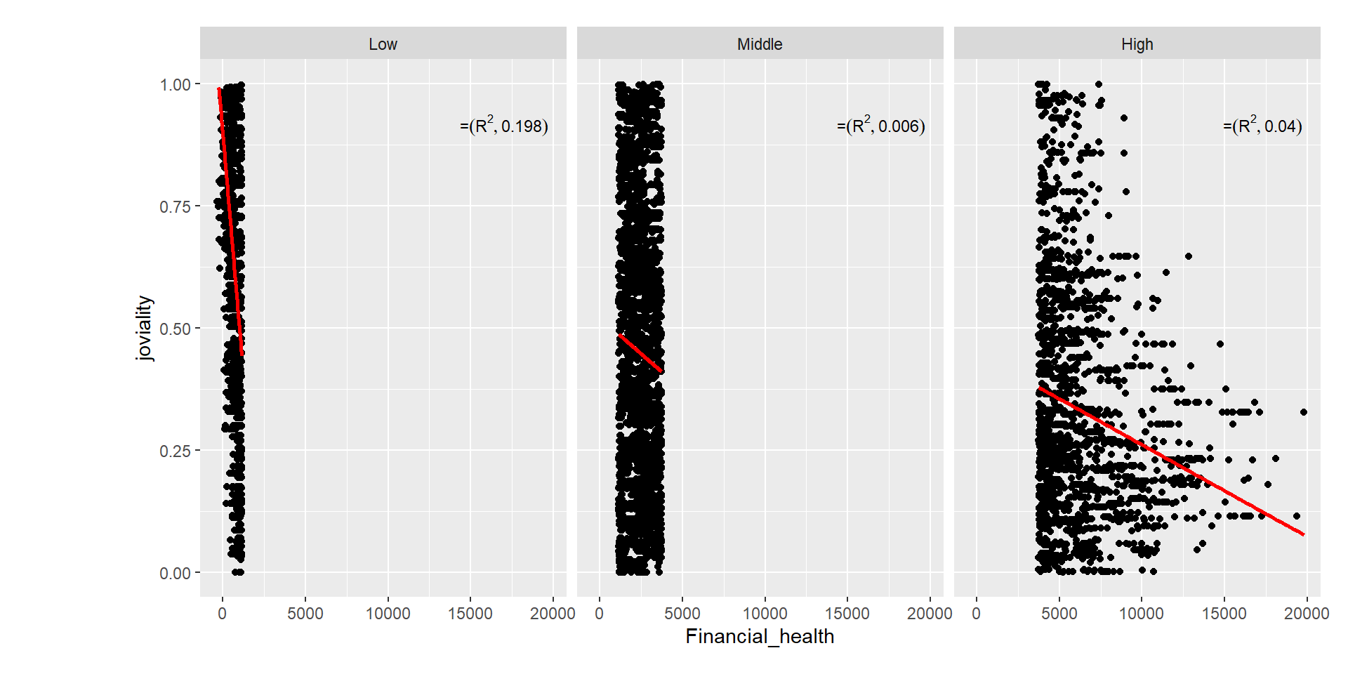
4.2.2 Joviality is affected by Cost of Living
To test the significance of correlation between joviality and cost of living, the following code chunk is used, and we notice that the slight positive correlation for 0.45.
Show the code
ggscatterstats(
  data = combined_table,
  x = Cost_of_living,
  y = joviality,
  marginal = FALSE,
  )
Joviality vs expense_category
We can see that food expenses has the highest correlation at 0.49. Thus, the city planners and managers can consider allocating a portion of the grant to food expenses.
Show the code
# Select columns by name for the correlation matrix
cols <- c("joviality", "Food", "Education", "Shelter", "Recreation")

# Plot the ggcorrmat
ggstatsplot::ggcorrmat(
  data = combined_table,
  cor.vars = cols, hc.order = TRUE, p.mat=p.mat,
  title = "Joviality Correlation Table")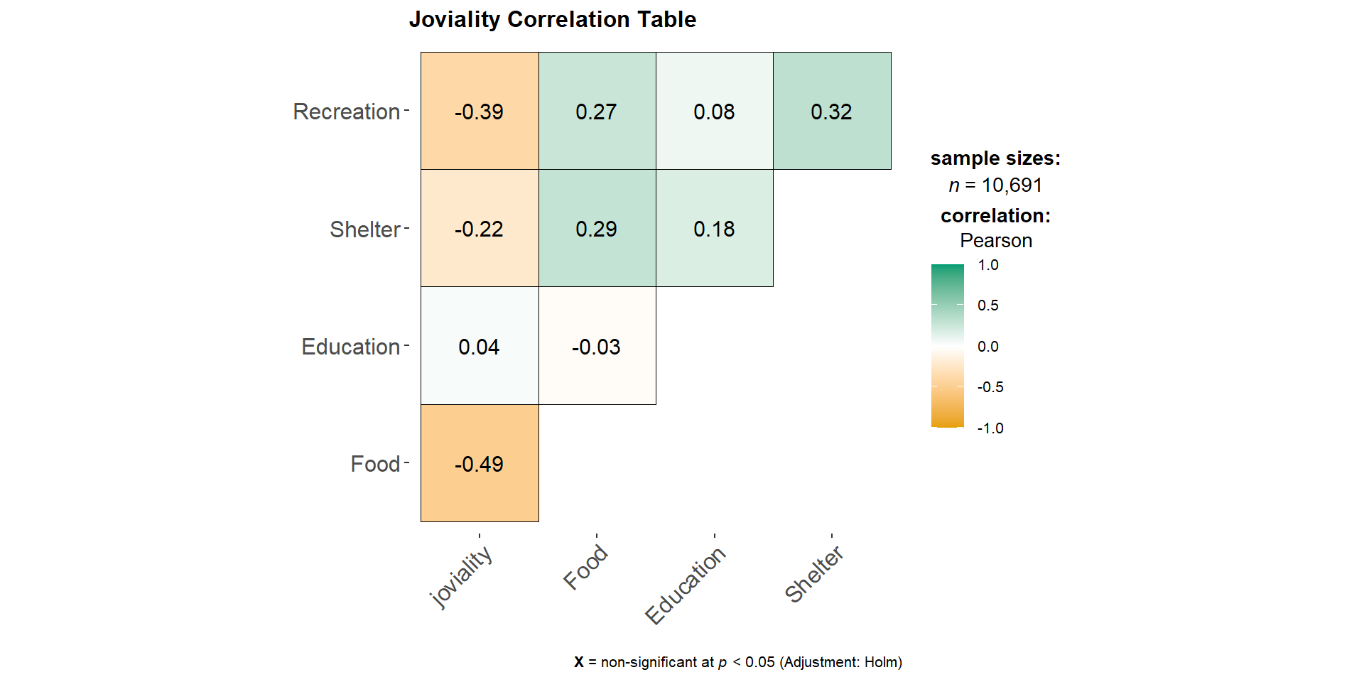
Show the code
# Select only the columns of interest from combined_table
data_reg <- select(combined_table, Shelter, Food, Education, Recreation, joviality)

data_reg <- data_reg %>%
  mutate_at(vars(Shelter, Food, Education, Recreation), abs)

# Melt data into long format
data_reg <- reshape2::melt(data_reg, id.vars = "joviality")

#Create plot with multiple regression lines

ggplot(data_reg, aes(x = value, y = joviality, color = variable)) +
  geom_point(size = 0.25) +
  geom_smooth(method = "lm", formula = y ~ x, se = FALSE, aes(group = variable)) +
  xlab("Expenses_type") +
ylab("Joviality") 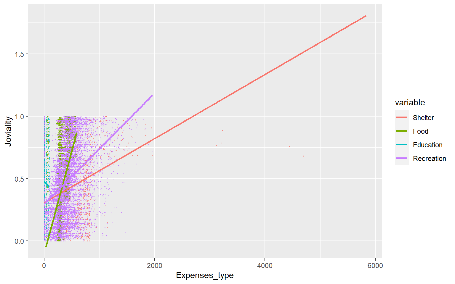
4.3 Observation on Interest Groups
We can plot the histogram below to observe the distribution of the different interest interest group. As seen from below, there is roughly the same proportion of participants in each group.
Show the code
combined_table_grp <- combined_table %>%
  group_by(participantId) %>%
  summarise(interestGroup = first(interestGroup), age_bin = first(age_bin)) # assuming interestGroup and age_bin are constant for each participantID

ggplot(data = combined_table_grp, aes(x = interestGroup)) +
  stat_count(color="black", fill="azure4") +
  labs(x = "Interest Groups", y = "Number of participants") +
  ggtitle("Distribution of interest groups") +
  geom_text(stat = "count", aes(label=..count..), vjust=-0.5) +
  theme(axis.text.x = element_text(angle = 45, hjust = 1))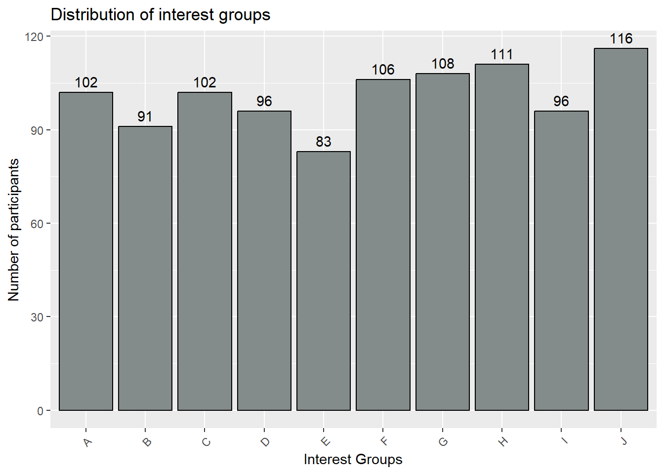
Furthermore, we can use the heatmap to have overall glimpse of the interest groups by age_bin to see if it affects the type of interest participants are in.
From the heatmap below, we can see that there is a high proportion of age_bin [30,40) that are in Interest Group H.
Show the code
#Group the data by interest group and age bin, and count the number of participants

df_heatmap <- combined_table_grp %>%
  group_by(interestGroup, age_bin) %>%
  summarize(n = n()) %>%
  ungroup()

# Create a heatmap
ggplot(data = df_heatmap, aes(x = interestGroup, y = age_bin, fill = n)) +
  geom_tile() +
  scale_fill_gradientn(colors = c("lightblue", "red"), na.value = "white") +
  labs(x = "Interest Group", y = "Age Bin", fill = "Number of Participants") +
  ggtitle("Heatmap of Participants by Interest Group and Age") +
  theme(plot.title = element_text(hjust = 0.5))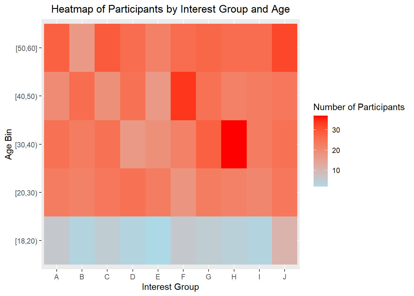
4.4 Visualizing uncertainty
4.4.1 Visualizing uncertainty of point estimates
It can be tempting to interpret point estimates like median as the true precise representation of the true data value. However, it should be noted that there are uncertainties surrounding these point estimates. Thus we want to show the target quantile confidence levels (95% or 99%) that the true (unknown) estimate would like within the interval, given evidence provided by observed data.
As can been seen from the age_bin plot below, some age_bin have higher uncertainties such as age_bin [20,30) and [50,60]. This could be due to the presence of large no of outliers, and probably at the stage of the deciding their career path. On the other hand, age_bin such as [18,20) has less uncertainties,which may indicate lower presence of outliers.
Likewise, for the educationLevel plot below, low level education has less uncertainties, while the higher educationLevel, the higher the uncertainties get.
Show the code
#Base ggplot
ggplot(data = combined_table,
  aes(x = age_bin,
      y = Wage)) +

#Using stat_pointinterval to plot the points and intervals
  stat_pointinterval(
    aes(interval_color = stat(level)),
    .width = c(0.95, 0.99),
    .point = median,
    .interval = qi,
    point_color = "darkred",
    show.legend = FALSE) +

#Defining the color of the intervals
  scale_color_manual(
    values = c("blue2", "darkblue"),
    aesthetics = "interval_color") +

#Title, subtitle, and caption
  labs(title = 'Visualising uncertainty in median estimates of wage by age_bin',
  subtitle = 'Quantiles intervals (95% and 99%) of wage by age_bin',
  x = "age_bin",
  y = "Wage") +

  theme_hc() +

  theme(plot.title = element_text(face = "bold", size = 18),
        plot.subtitle = element_text(size = 14),
        axis.text.x = element_text(angle = 30, hjust = 1))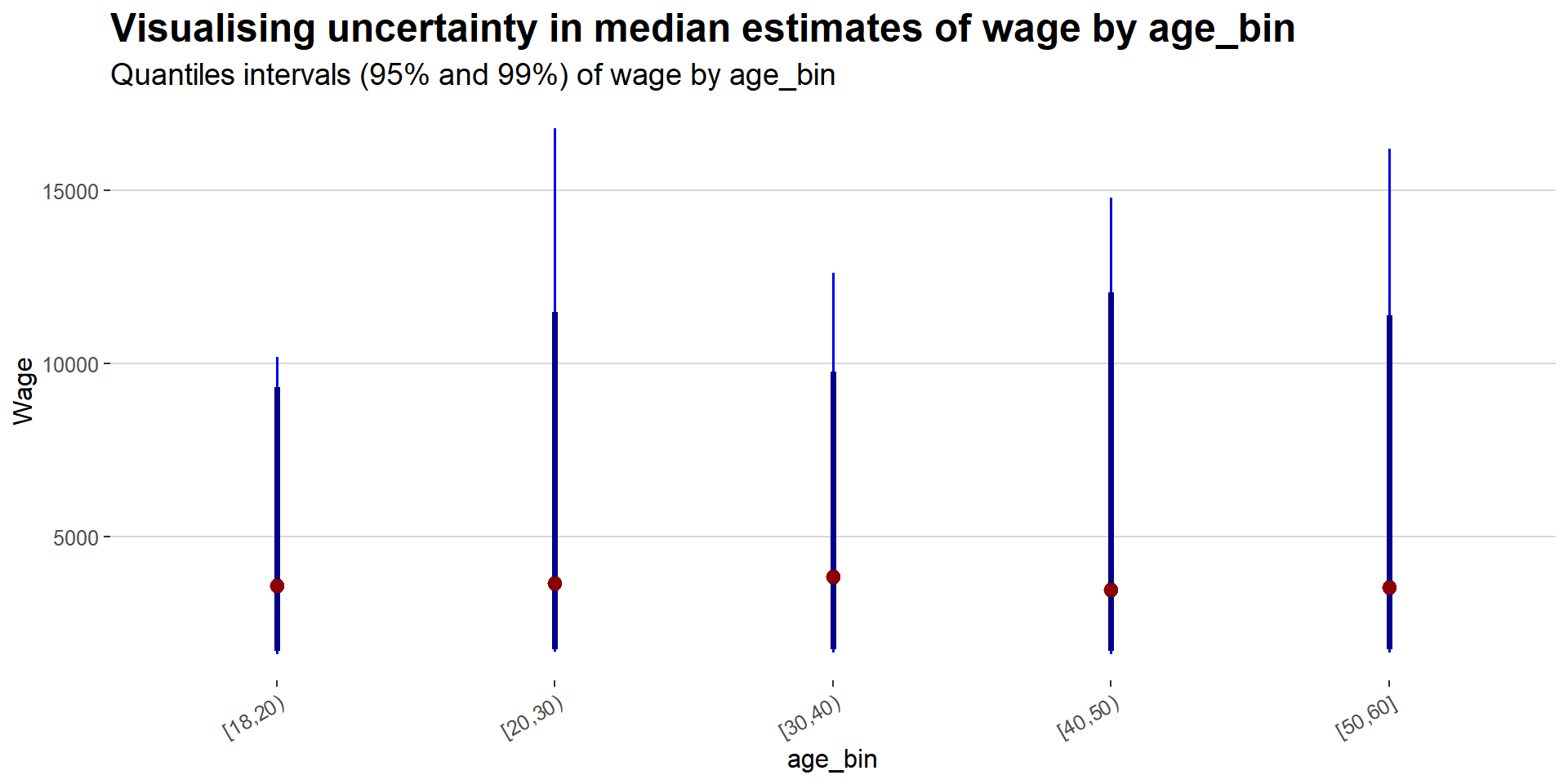
Show the code
#Base ggplot
ggplot(
  data = combined_table,
  aes(x = educationLevel,
      y = Wage)) +

#Using stat_pointinterval to plot the points and intervals
  stat_pointinterval(
    aes(interval_color = stat(level)),
    .width = c(0.95, 0.99),
    .point = median,
    .interval = qi,
    point_color = "darkred",
    show.legend = FALSE) +

#Defining the color of the intervals
  scale_color_manual(
    values = c("blue2", "darkblue"),
    aesthetics = "interval_color") +

#Title, subtitle, and caption
  labs(title = 'Visualising uncertainty in median estimates of wage by educationLevel',
  subtitle = 'Quantiles intervals (95% and 99%) of wage by educationLevel',
  x = "educationLevel",
  y = "Wage") +

  theme_hc() +

  theme(plot.title = element_text(face = "bold", size = 18),
        plot.subtitle = element_text(size = 14),
        axis.text.x = element_text(angle = 30, hjust = 1))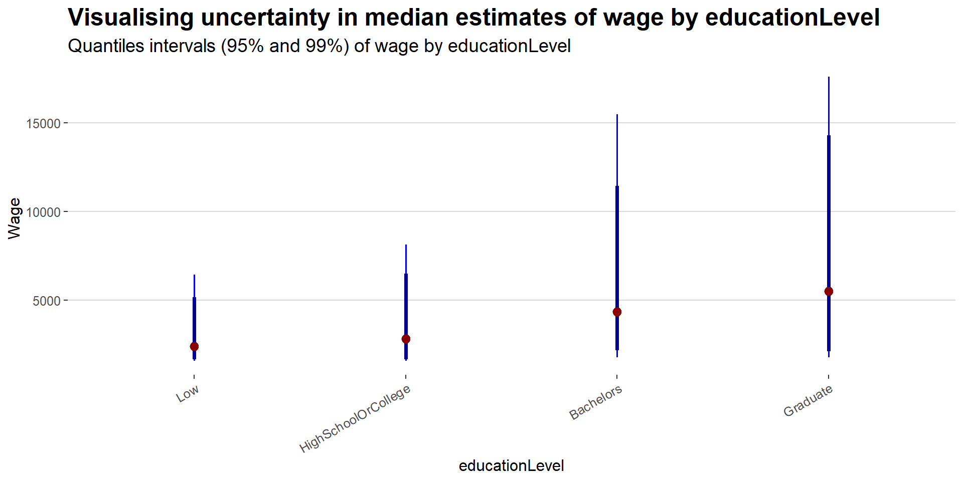
4.4.2 Visualizing Uncertainty with Hypothetical Outcome Plots (HOPs)
HPOs can help to illustrate the uncertainty and variability of the data and model predictions, and highlight the potential impact of different variables or factors on the outcomes of interest.
Show the code
library(ungeviz)

ggplot(data = combined_table,
        (aes(x = factor(age_bin), y = Wage))) +
   geom_point(position = position_jitter(
     width = 0.05, height = 0.3),
     size = 0.4, color = "#0072B2", alpha = 1/2) +
   geom_hpline(data = sampler(25, group = age_bin), height = 0.6, color = "#D55E00") +
   theme_bw() +
  transition_states(.draw, 1, 3)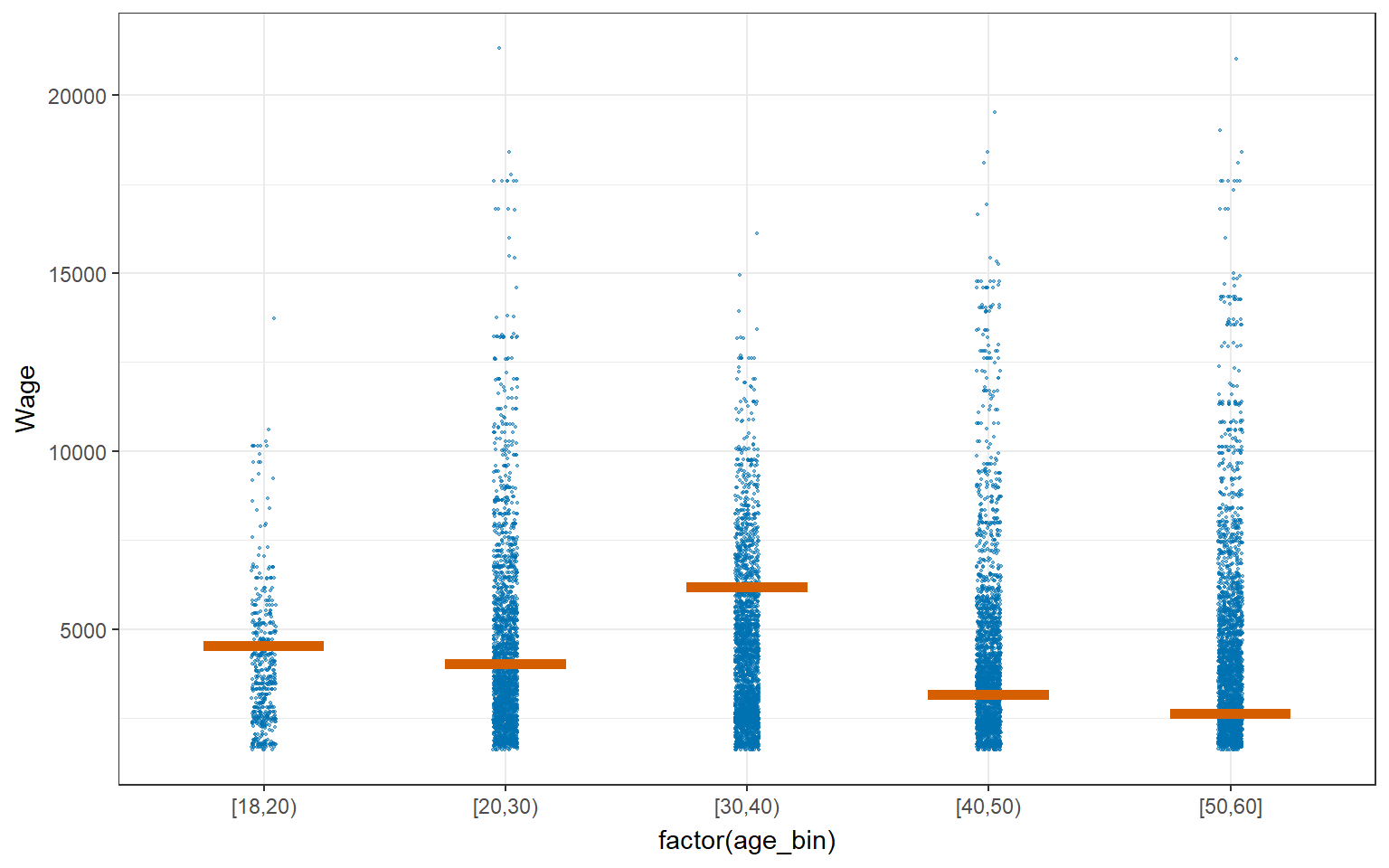
Show the code
ggplot(data = combined_table,
        aes(x = factor(educationLevel), y = Wage)) +
   geom_point(position = position_jitter(
     width = 0.05, height = 0.3),
     size = 0.4, color = "#0072B2", alpha = 1/2) +
   geom_hpline(data = sampler(25, group = educationLevel), height = 0.6, color = "#D55E00") +
   theme_bw() +
   transition_states(.draw, 1, 3)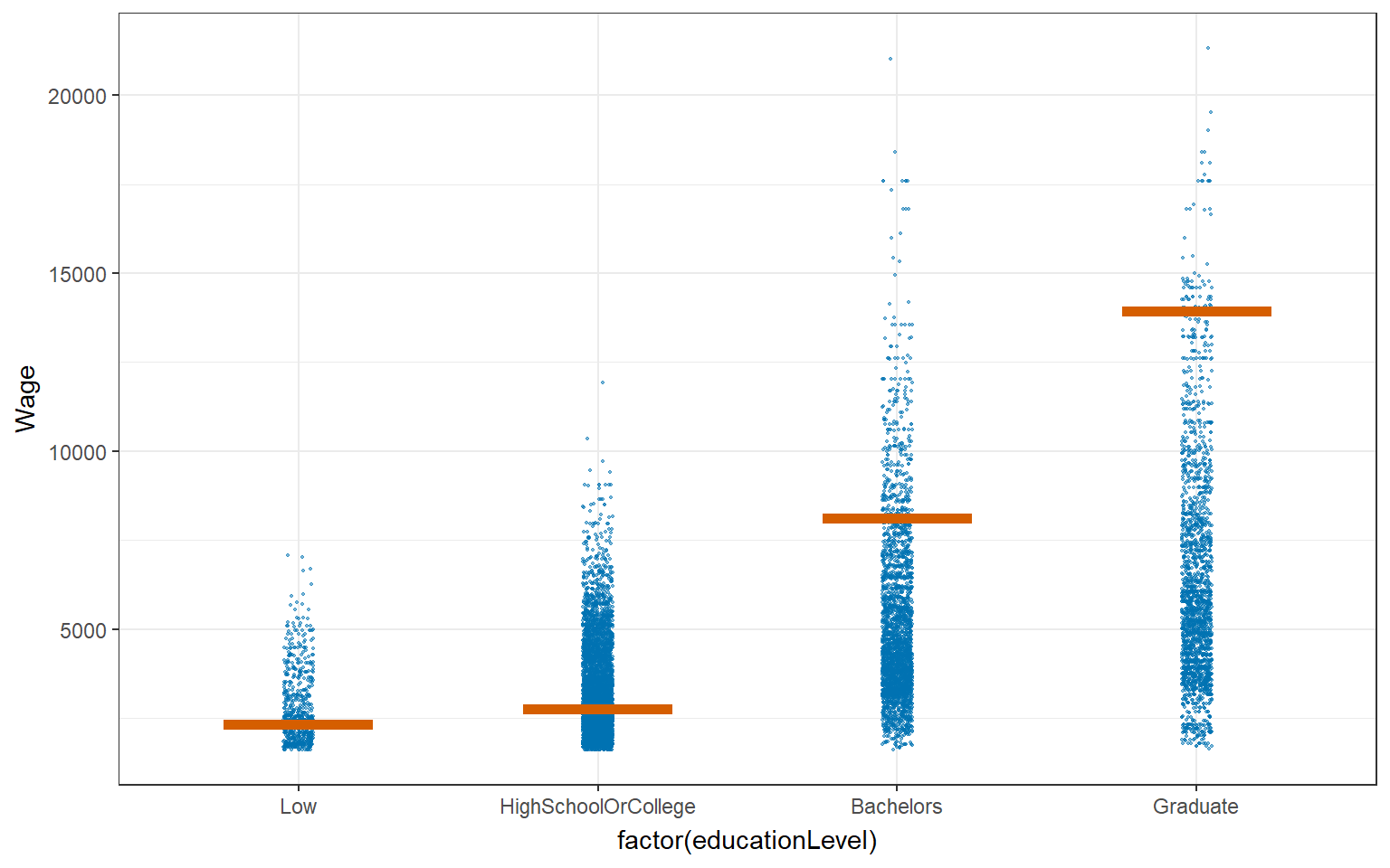
5. References
Seniors’ past works