pacman::p_load(rstatix,gt,patchwork,tidyverse,ggstatsplot,ggpubr)In-Class Exercise 4
1. Getting Started
Install and launching R packages
Importing data
exam_data <- read_csv("data/Exam_data.csv")2. Visualising Normal Distribution
2.1 Using QQplot
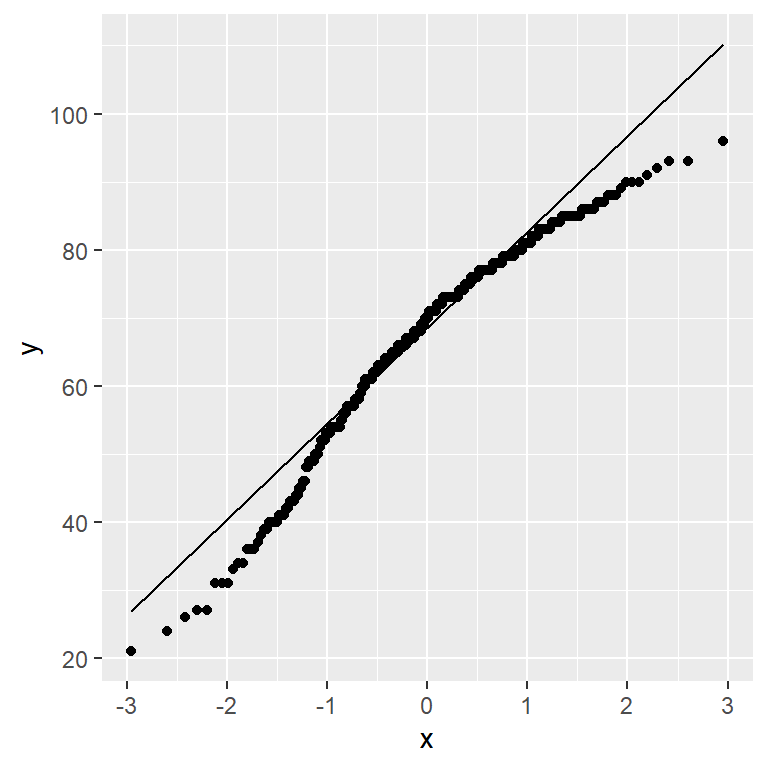
ggplot(exam_data,
       aes(sample=ENGLISH))+
  stat_qq() +
  stat_qq_line()
Note
We can see that the points deviate significantly from the straight diagonal line. This is a clear indication that the set of data is not normally distributed.
2.1.1 Combining statistical graph and analysis table
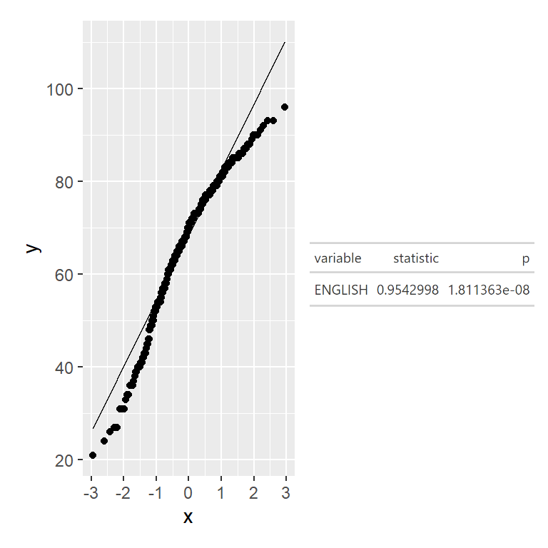
ggplot(exam_data,
       aes(sample=ENGLISH))+
  stat_qq() +
  stat_qq_line()