pacman::p_load(ggrepel, patchwork,
               ggthemes, hrbrthemes,
tidyverse) Hands-on Exercise 2: Creating Elegant Graphics with ggplot2
1. Getting Started
Install and launching R packages
The code chunck below will be used to check if these packages have been installed and also will load them onto your working R environment.
Importing the data
exam_data <- read_csv("data/Exam_data.csv")Rows: 322 Columns: 7
── Column specification ────────────────────────────────────────────────────────
Delimiter: ","
chr (4): ID, CLASS, GENDER, RACE
dbl (3): ENGLISH, MATHS, SCIENCE
ℹ Use `spec()` to retrieve the full column specification for this data.
ℹ Specify the column types or set `show_col_types = FALSE` to quiet this message.2. Exercises
2.1 Working with ggrepel
ggrepel helps to repel overlapping text
ggplot(data=exam_data,
       aes(x= MATHS,
           y=ENGLISH)) +
  geom_point() +
  geom_smooth(method=lm,
              size=0.5) +
  geom_label(aes(label = ID),
             hjust = .5,
             vjust = -.5) +
  coord_cartesian(xlim=c(0,100),
                  ylim=c(0,100)) +
  ggtitle("English scores versus Maths scores for Primary 3")
Warning: Using `size` aesthetic for lines was deprecated in ggplot2 3.4.0.
ℹ Please use `linewidth` instead.`geom_smooth()` using formula = 'y ~ x'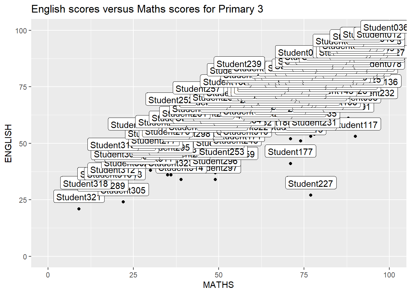
Simply replace geom_text() by geom_text_repel() and geom_label() by geom_label_repel.
ggplot(data=exam_data,
       aes(x= MATHS,
           y=ENGLISH)) +
  geom_point() +
  geom_smooth(method=lm,
              size=0.5) +
  geom_label_repel(aes(label = ID),
                   fontface = "bold") +
  coord_cartesian(xlim=c(0,100),
                  ylim=c(0,100)) +
  ggtitle("English scores versus Maths scores for Primary 3")
`geom_smooth()` using formula = 'y ~ x'Warning: ggrepel: 317 unlabeled data points (too many overlaps). Consider
increasing max.overlaps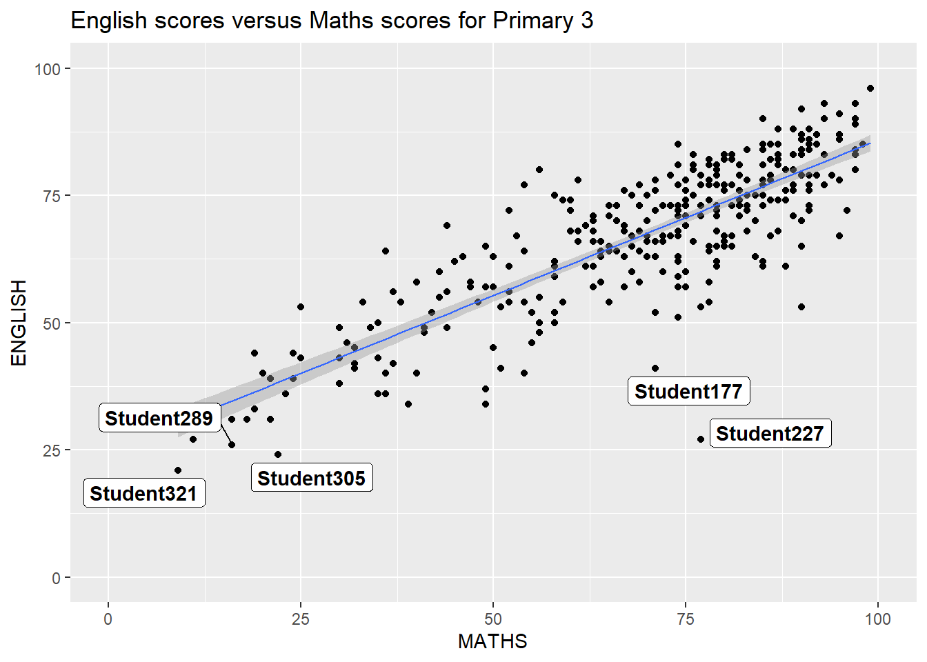
2.2 Working with Themes
8 Built-in Themes: theme_gray(), theme_bw(), theme_classic(), theme_dark(), theme_light(), theme_linedraw(), theme_minimal(), and theme_void()
ggplot(data=exam_data,
             aes(x = MATHS)) +
  geom_histogram(bins=20,
                 boundary = 100,
                 color="grey25",
                 fill="grey90") +
  theme_gray() +
  ggtitle("Distribution of Maths scores")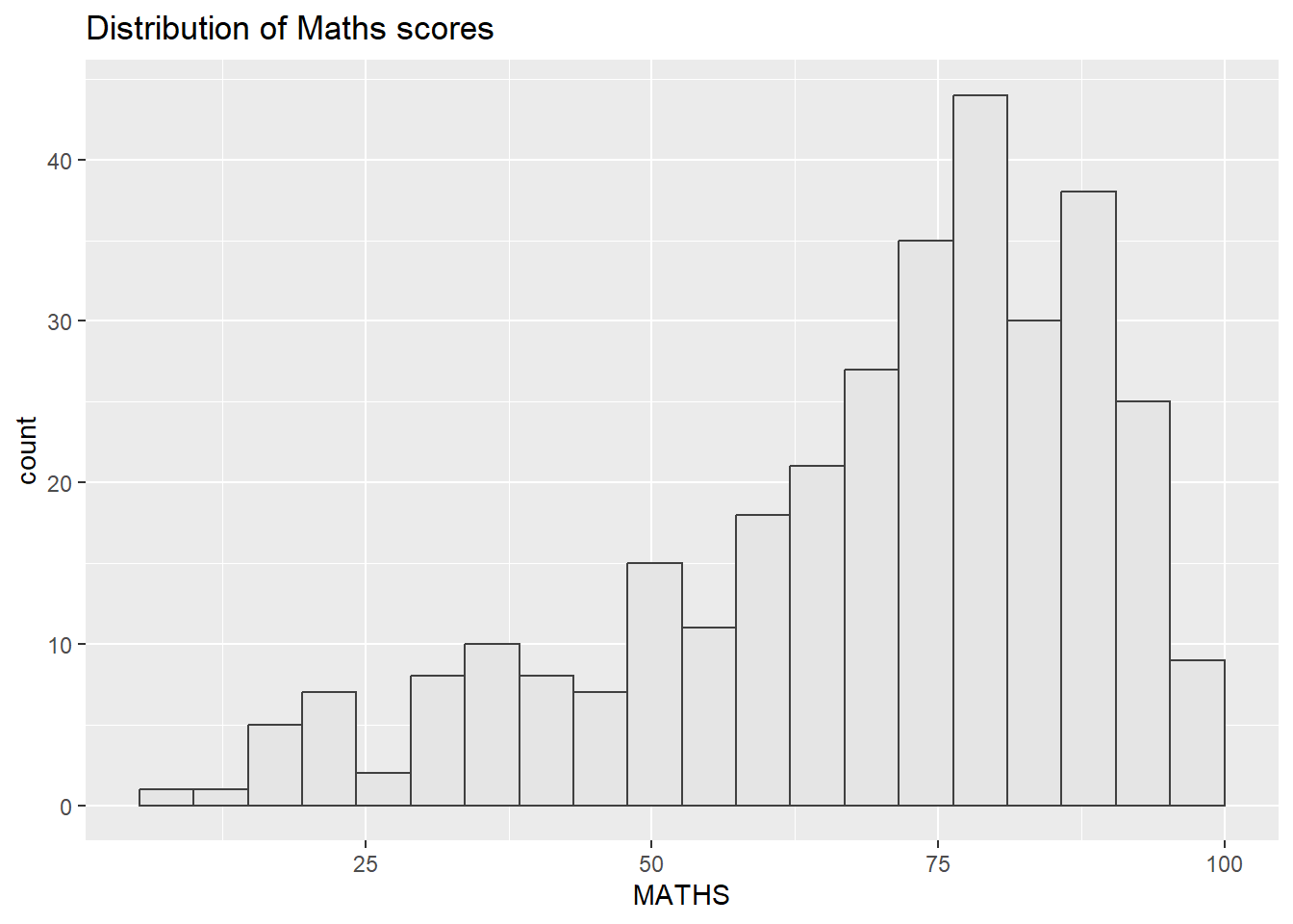
Using ggtheme package
In the example below, The Economist theme is used.
ggplot(data=exam_data,
             aes(x = MATHS)) +
  geom_histogram(bins=20,
                 boundary = 100,
                 color="grey25",
                 fill="grey90") +
  ggtitle("Distribution of Maths scores") +
  theme_economist()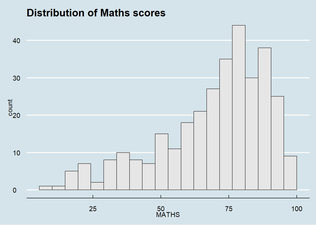
Using hrbthems package
Provides a base theme that focuses on typographic elements, including where various labels are placed and fonts used.
ggplot(data=exam_data,
             aes(x = MATHS)) +
  geom_histogram(bins=20,
                 boundary = 100,
                 color="grey25",
                 fill="grey90") +
  theme_ipsum(axis_title_size = 18,       #increase font size of axis title to 18
              base_size = 15,             #increase default axis label to 15
              grid = "Y") +               # keep only y-axis grid lines
  ggtitle("Distribution of Maths scores")
Warning in grid.Call(C_stringMetric, as.graphicsAnnot(x$label)): font family not
found in Windows font database
Warning in grid.Call(C_stringMetric, as.graphicsAnnot(x$label)): font family not
found in Windows font databaseWarning in grid.Call(C_textBounds, as.graphicsAnnot(x$label), x$x, x$y, : font
family not found in Windows font database
Warning in grid.Call(C_textBounds, as.graphicsAnnot(x$label), x$x, x$y, : font
family not found in Windows font database
Warning in grid.Call(C_textBounds, as.graphicsAnnot(x$label), x$x, x$y, : font
family not found in Windows font database
Warning in grid.Call(C_textBounds, as.graphicsAnnot(x$label), x$x, x$y, : font
family not found in Windows font database
Warning in grid.Call(C_textBounds, as.graphicsAnnot(x$label), x$x, x$y, : font
family not found in Windows font database
Warning in grid.Call(C_textBounds, as.graphicsAnnot(x$label), x$x, x$y, : font
family not found in Windows font database
Warning in grid.Call(C_textBounds, as.graphicsAnnot(x$label), x$x, x$y, : font
family not found in Windows font database
Warning in grid.Call(C_textBounds, as.graphicsAnnot(x$label), x$x, x$y, : font
family not found in Windows font database
Warning in grid.Call(C_textBounds, as.graphicsAnnot(x$label), x$x, x$y, : font
family not found in Windows font databaseWarning in grid.Call.graphics(C_text, as.graphicsAnnot(x$label), x$x, x$y, :
font family not found in Windows font databaseWarning in grid.Call(C_textBounds, as.graphicsAnnot(x$label), x$x, x$y, : font
family not found in Windows font database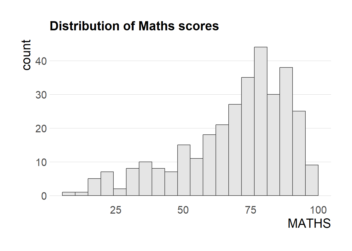
2.3 Beyond Single Graph
Create composite plot by combining multiple graphs First, create the three statistical graphics below
p1 <- ggplot(data=exam_data,
             aes(x = MATHS)) +
  geom_histogram(bins=20,
                 boundary = 100,
                 color="grey25",
                 fill="grey90") +
  coord_cartesian(xlim=c(0,100)) +
  ggtitle("Distribution of Maths scores")

p2 <- ggplot(data=exam_data,
             aes(x = ENGLISH)) +
  geom_histogram(bins=20,
                 boundary = 100,
                 color="grey25",
                 fill="grey90") +
  coord_cartesian(xlim=c(0,100)) +
  ggtitle("Distribution of English scores")

p3 <- ggplot(data=exam_data,
             aes(x= MATHS,
                 y=ENGLISH)) +
  geom_point() +
  geom_smooth(method=lm,
              size=0.5) +
  coord_cartesian(xlim=c(0,100),
                  ylim=c(0,100)) +
  ggtitle("English scores versus Maths scores for Primary 3")
Working with patchwork
Creating patchwork Use ‘+’ to create two columns layout Use ‘/’ to create two row layout (stack) Use ‘()’ to create subplot group Use ‘|’ to place the plots beside each other
((p1 / p2) | p3) +
  plot_annotation(tag_levels = 'I')   #creating a composite figure with tag
`geom_smooth()` using formula = 'y ~ x'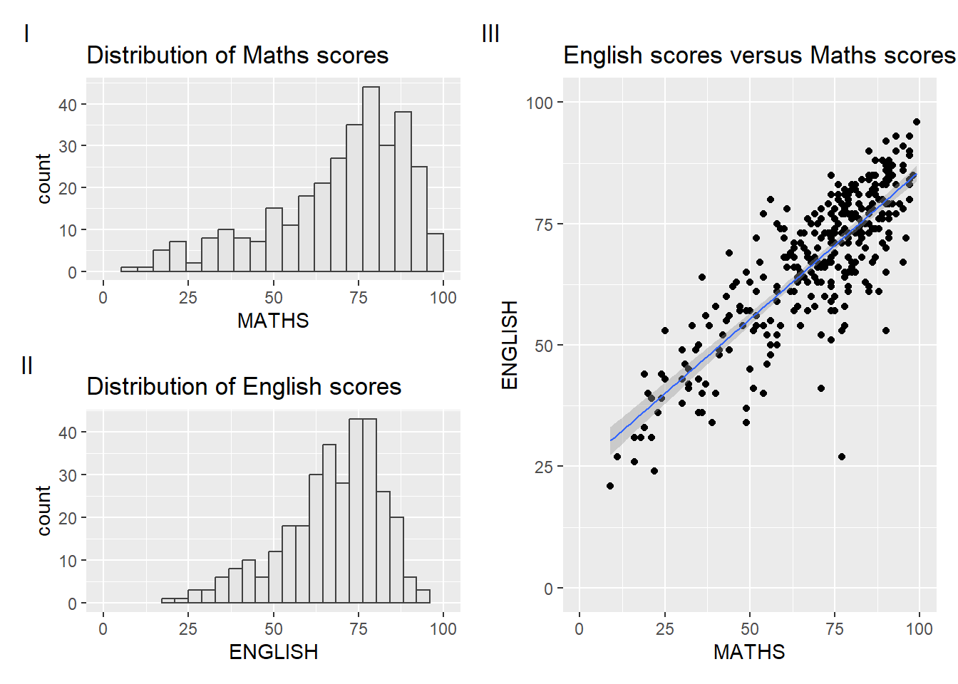
Combining patchwork and themes
((p1 / p2) | p3) & theme_economist()`geom_smooth()` using formula = 'y ~ x'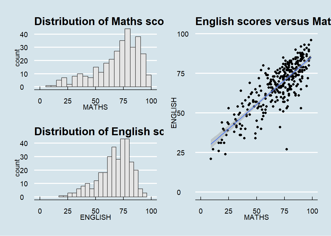
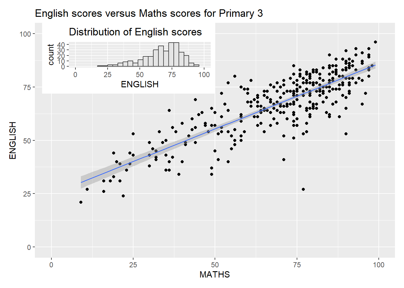
Insert another plot in a plot with inset_element()
p3 + inset_element(p2,
                   left = 0.02,
                   bottom = 0.7,
                   right = 0.5,
                   top = 1)
`geom_smooth()` using formula = 'y ~ x'